

THE BRIEF
Santé Circle Health was looking to roll out an app to help people get the workplace accommodations that they need to get back to work, based upon a significant set of diagnostic questions and their subsequent report.
RESEARCH
As a base, we were drawing from our client’s lifetime of experience in the field. To get a fuller picture of people’s experiences in this space, we interviewed eleven people involved in all aspects of the workplace accommodation process: healthcare professionals, managers, evaluators and blue and white collar workers (our users) who had prior experience of the disability and workplace accommodation process.
SANTÉ CIRCLE HEALTH
Team:
Michael Mabee - UX Design
Sissi Ke - UX Design
Kat Valle - UX Design
Fahimé Shah - UI Design
Time Frame:
3 Weeks
Software Used:
Figma
Prototype:
Please contact me to see prototypes.
Case Study:

Based on the results of those interviews, we made up four user personas: Obvious Users, Hidden Users, Managers and Healthcare Professionals. Each would have a different perspective coming into usage of the app. Going into the design of the client-facing side the app, we would focus on the Obvious User (Jose) and Hidden User (Abby).


In talking with our users about their experiences with the workplace accommodation process, we heard that most of what they had been through was frustrating, difficult or straight-up awful. In order to better parse the information, we broke up all of the interviews into their most granular pieces ideas and tried to find ways that they fit together. The Affinity Diagram that we ended up with (above) put their experiences with Medical Issues, Medical Personnel, the Process and their Employers onto an emotional axis, from negative to positive. Please notice the lack of notes on the positive side of the spectrum.
SAM by Santé Circle Health would help our users mitigate the difficulties in the darker blue boxes through accommodation, streamline the process and allow medical professionals more time and resources to see to all of the other issues.
The insights we uncovered were:
-
the process is difficult and complicated, and is made worse by the injury/state of mind people are in when the come to it
-
people are unaware/uncertain of the possible outcomes
-
people are pessimistic about their employer's reaction to a request
-
people are deeply concerned about privacy/confidentiality
THE COMPETITION

To wrap up the research phase, we looked at other players in the wellness space and the only other workplace accommodation app we could find North America. What we found was that wellness apps for people who were looking to track their health gave their users a great experience, but had no real power to get them help when they needed it. On the other hand, the one workplace accommodation app that had real power to change its users lives gave them an awful experience – enough to drive them away from the process all together.
PLANNING
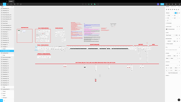
Our goal became to give Santé Circle Health’s users the most comfortable, expedient experience possible, so that they can get the healthcare they need and get back to work sooner. In planning the app, we knew we had two major components that we had to connect for the user: the questionnaire and the reports. We had to make it comfortable and easy for someone who may be in pain or distress to sit through an extended questionnaire (up to 60 questions at one point) to get the results that they want from the accommodation process. This was our user’s flow through the app:

In addition to the questions and reports, the key strategic points we decided we had to hit were:
-
An easy-to-understand, digestible, informative onboarding process.
-
Giving milestones to the user that reward their progress through and completion of the questionnaire.
-
Giving our user enough information to complete their next steps in the process, rather overloading them with an infodump too early.
-
Using reassuring, clear language throughout the process.
DESIGN & TESTING
In the design phase, having seen how others had made the process uncomfortable through mechanical language an de-personalized grey interfaces, we knew what we had to do. We turned to the most reassuring of shapes, the circle, which was a natural fit for our client, Santé Circle Health. We paired that with a calming, soothing, healthcare-oriented colour palette.
We explored ways that we could make the process personable, conversational and rewarding. Using illustrations throughout and giving SAM a face made our users more comfortable. Having SAM guide them through the process in a series of conversational speech bubbles made it a warmer experience, without the perception of interrogation that a photo of an actual person might bring.

We shaped the questionnaire into a suite of yes/no binary options (always allowing for a ‘not sure’) so that each question required minimal deliberation. Later iterations included strategic emphasis of the wording, so that users could grasp the important parts of the questions while skimming them, making the questionnaire even faster. We also removed every distraction possible (the Home button and Logo) and gave them a Back button, in case they accidentally hit the wrong response.
In testing, we found a major flaw: the onboarding. We hadn’t centered it on the user— we’d focused on the app and its features. It left our user feeling unheard and didn’t reassure them that SAM was the solution to their issues. We reformulated it to speak directly to their needs and it resonated much more with subsequent testers.
PROTOTYPE

Contact me to see prototypes.
CONCLUSION
Within 3 weeks, we went from a block of questions and a set of sample reports to a fully-functioning prototype with its own personality. This app will potentially help thousands of people each year get assistance to be better at work, rather than suffering at home in silence.
In the following months, we helped create the employer-facing side of the app, so they can better understand the health of their workforce and mitigate their losses due to absenteeism.
To see my full case study for this project, please visit Medium.com
Prototypes and identifying details have been removed at the client's request. Please contact me for more information.