

While at RED Academy, I was fortunate to be chosen to work with Planned Parenthood Toronto. My team took on their outdated site in order to streamline it and make the content more visible. We had a significant challenge in that they have a gigantic number of services, programs and resources spanning sexual and reproductive health, mental health and primary care.
RESEARCH
We started with a full slate of interviews: everyone from the executive director to teen volunteers, as well as a number of their youth clients. After hearing their needs, absorbing their institutional perspective and reading all of their content, we got to work planning a new site.
PLANNED PARENTHOOD TORONTO
Team:
Michael Mabee - UX Design
Graham Mcfie - UX Design
Thea Barber - UX Design
Amanda Gangadeen - UI Design
Time Frame:
3 Weeks
Software Used:
Sketch
InVision
Prototype:
Case Study:

The user personas we arrived at after our significant research stage. These would be the people we would be building the site for, basing each decision on how they might navigate and interact with each page.
The insights we uncovered included:
-
access to services and resources is paramount, as it could literally mean the difference between life and death
-
prioritize direct navigation and clear language, to enable PPT's youth clientele, and newcomer youth in particular
-
PPT's site audience comes there for many reasons, but reaching out to, educating and serving their clients is the focus
PLANNING
This project was a major information architecture exercise: how to present hundreds of items (there are 55 fact sheets alone) in dozens of categories (with cross-relations) in a simple, digestible way. We started with a content audit, sectioned it by the audience that would access it and organized our navigation into logical entry points for each of our personas.

This card sort (above) was what we arrived at for managing PPT's navigation, taking all of their users into account and giving them easy access to the content they want.

DESIGN
In the initial sketching stage, the team decided on approaches that made sense for the audience and their needs. We arrived at a mix of traditional top-bar navigation and custom iconography that would highlight high-priority, high-access services and resources.

Additional safety consideration: I created this storyboard for a scenario that PPT was very concerned about – access to sexual and reproductive education for their newcomer youth clients who might be from a culture that might vigorously disapprove. We gave them an ever-present escape route.

We designed wireframes for an incredible number and variety of pages, by presenting PPT's programs and services content in easily-navigable patterns, while answering the visibility challenges posed by their users and staff.
See the mid-fi prototype here.
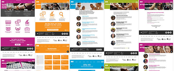
Above you can see a small sampling of the high-fidelity screens, populated with all of the final custom icons, updated text and photos, and styled following Planned Parenthood Toronto's established brand guidelines.
See the high-fi prototype here.
CONCLUSION
Going forward, we would love to complete the redesign – including the mobile version, as that is a key point of access – to ensure that PPT's youth clientele receive a level of service online that matches their excellent experience in the clinic.
To see my full case study for this project, please visit Medium.com.